My first project from LDR 141 taught me how to experiment with form while also having restrictions regarding how unequivocal or equivocal they should be. This is my first art class, so I aimed to really impress myself. I used photoshop to construct graphics in black and white. I closely followed the prompts and explored the different tools within photoshop which allowed me to build my skill.
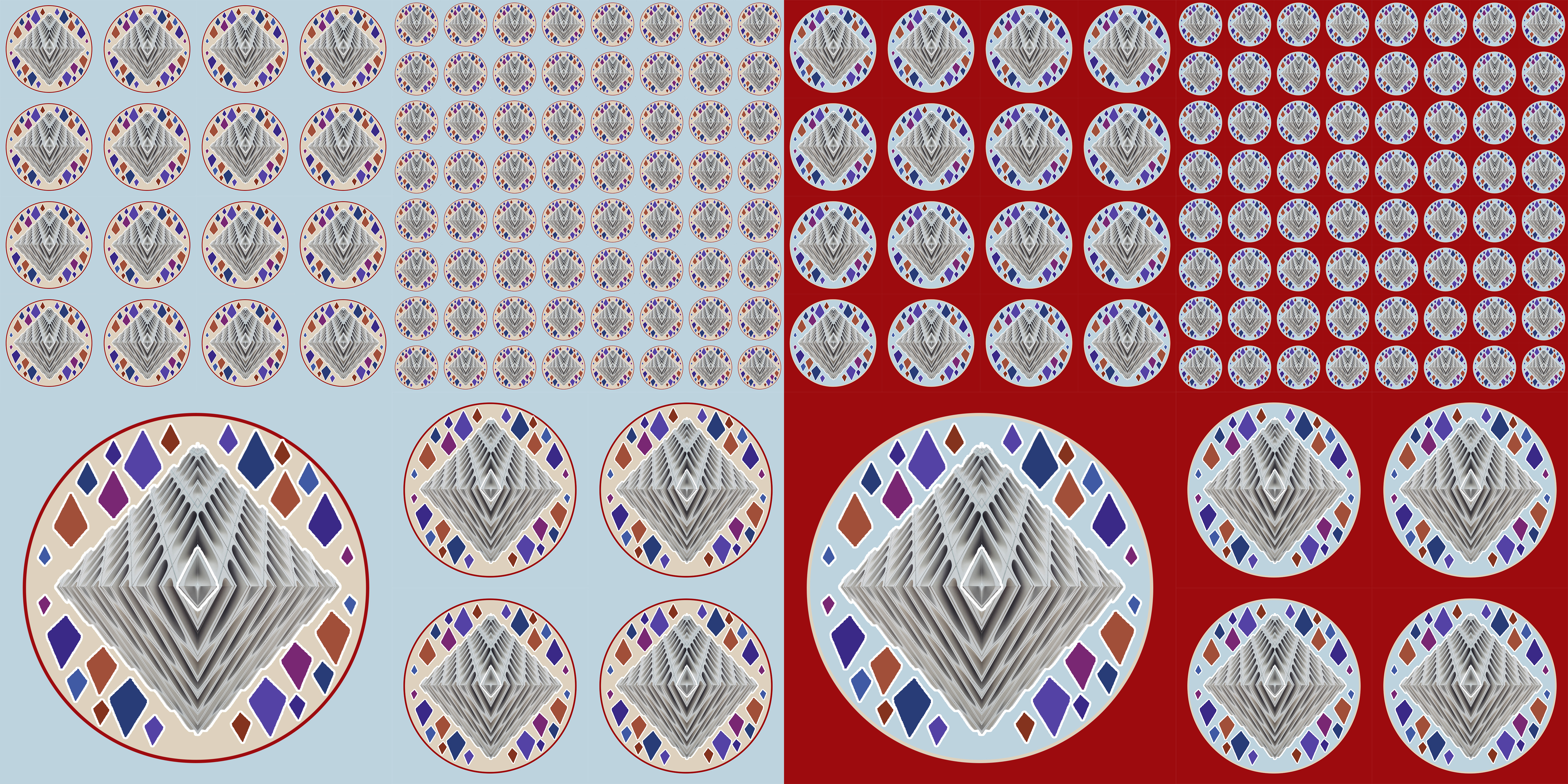
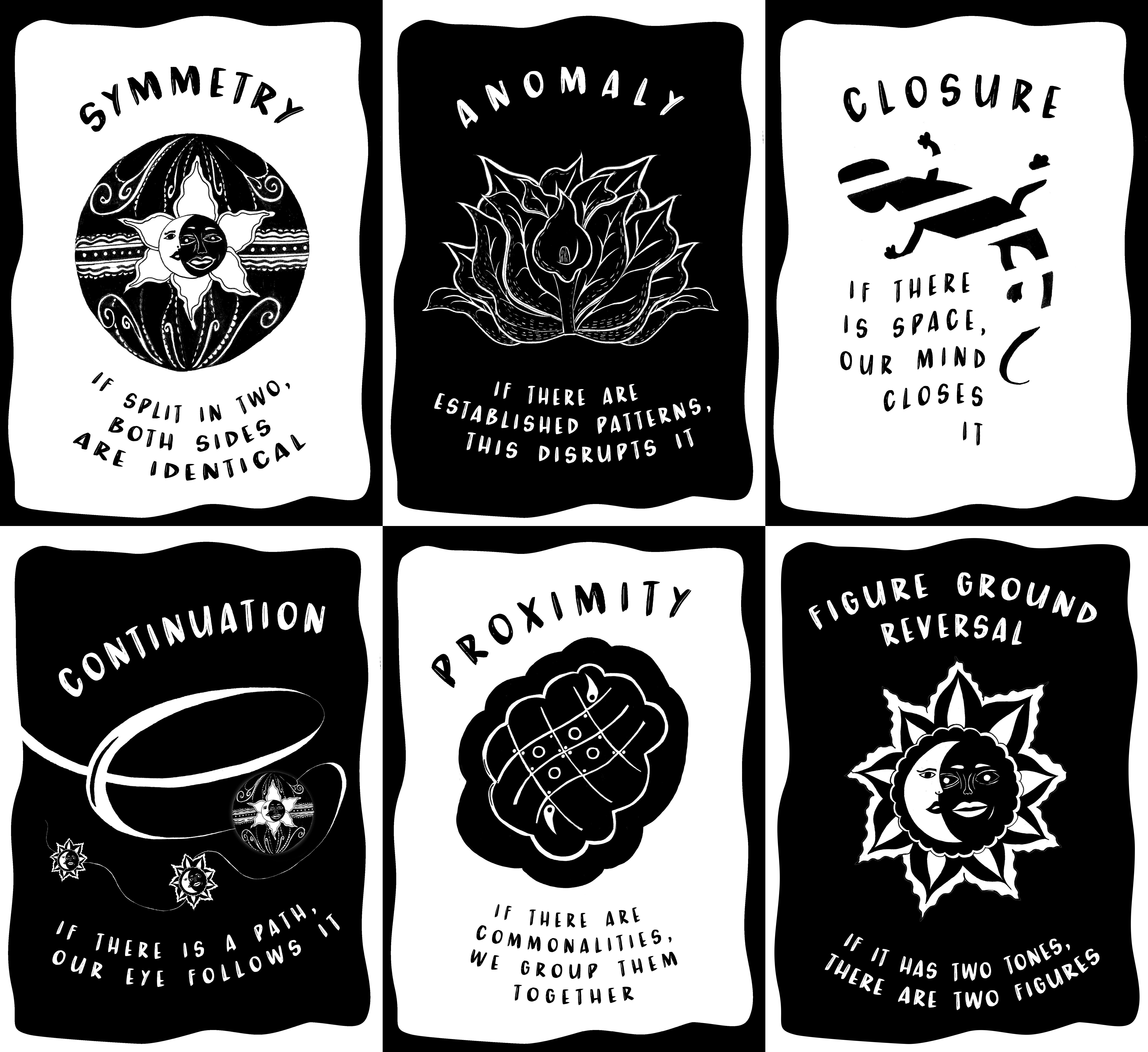
The Prompt: Create ten pieces integrating the negative shapes created by cropping a letter in 3 or more places. Five of the pieces must be unequivocal and the other five must be equivocal. There shall be no use of color, only shades of black and white. No duplications of shapes are allowed.


Art 141 with Professor Korol is my first art class. When the class was presented with out first project prompt, my head could not wrap around it. What is negative space? How do I open a new file? Photoshop has always been an interest of mine, but this is the first time I’m using the application to create thoughtful pieces. I relied heavily on youtube tutorials and observing my peers. I struggled with the color restrictions and the minimal number of shapes I had.
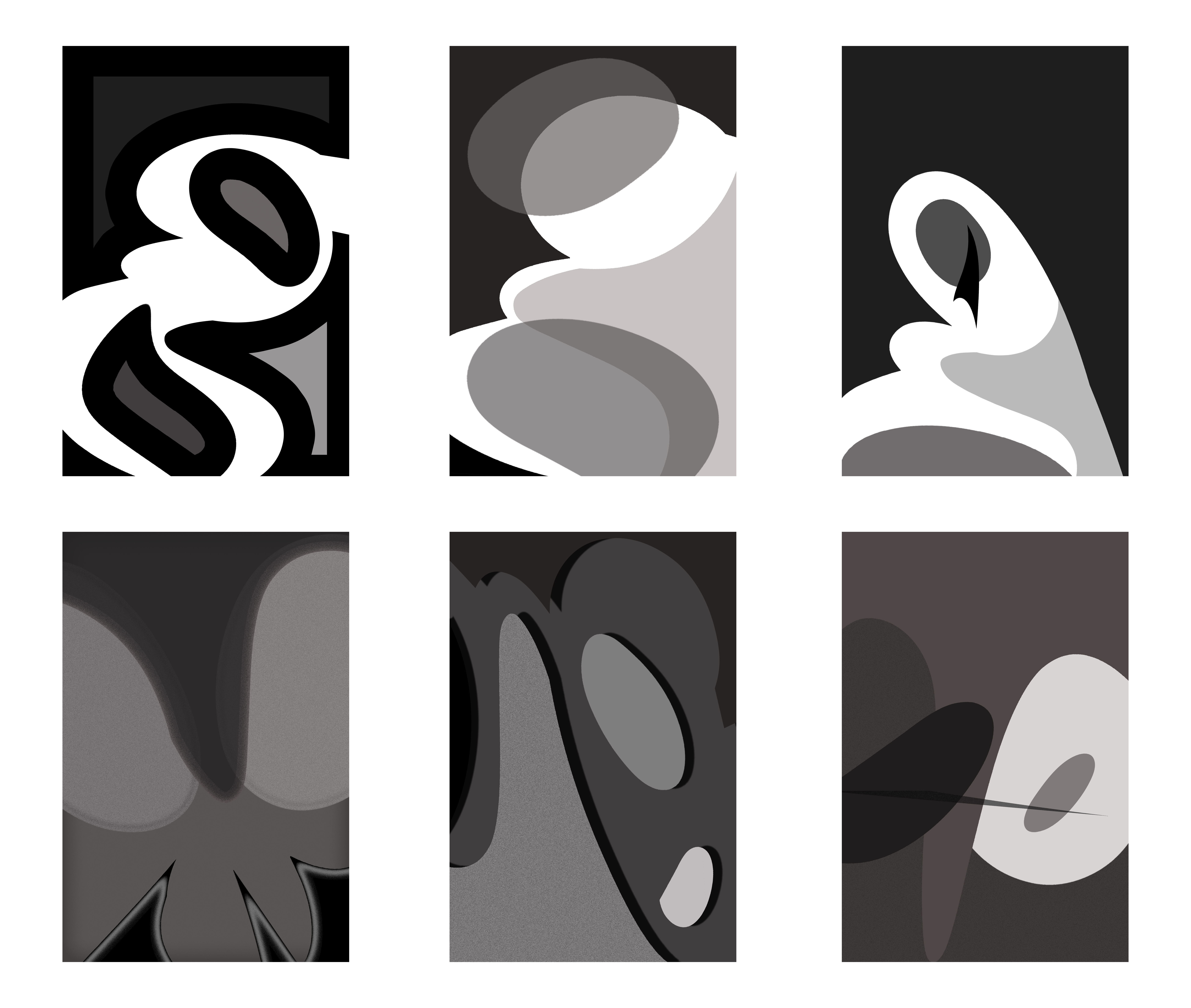
I first started with the letter ‘g’. My first piece (top middle) is a more conservative design compared to the others. This was due to the fact that I was learning to navigate photoshop. I worked with opacity, the transform tool, and the perspective warp tool. It is unequivocally a ‘g’. The shape of the ‘g’ was difficult to use because it can either be very distinct or completely abstract. My next piece (bottom left) is an abstract one. I experimented with the blending options for the layers. I manipulated noise, inner glow, and opacity. The dark tones and sharp shapes are meant to showcase an unsettling feeling in the viewer. I moved the shapes completely around and even sort of made a face. The last piece on the bottom right was my third design. I am unsatisfied with how it turned out, but the more I added or took away made me gravitate back to the original shape positions they were in. The perspective tool was complex to maneuver considering it altered only one layer at a time. I had to decide whether I wanted to merge the layers together to achieve the same perspective or recreate the perspective manually. My fourth piece was the bottom middle. I used a drop shadow and tried to magnify the use of perspective. I became really interested in the G’s curves and circular negative space. My fifth and sixth piece are more static compared to the rest. In the top left, I used some outlining tool that I exaggerated and I manipulated the shape extremely compared the more conservative approach I was going for. The top right was my last G and I tried to reflect how I felt at the time of creation.

The ‘R’ shape was much more easier for me to come up with varying designs. I had trouble keeping some of the designs unequivocal. The R shape only gave me four shapes, but they were more rigid compared to the ‘g’. I’m most proud of the top right. As I’m writing this i notice that my shapes all face the same direction. If I were to continue on this project I would go back and edit the flow.